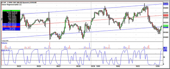
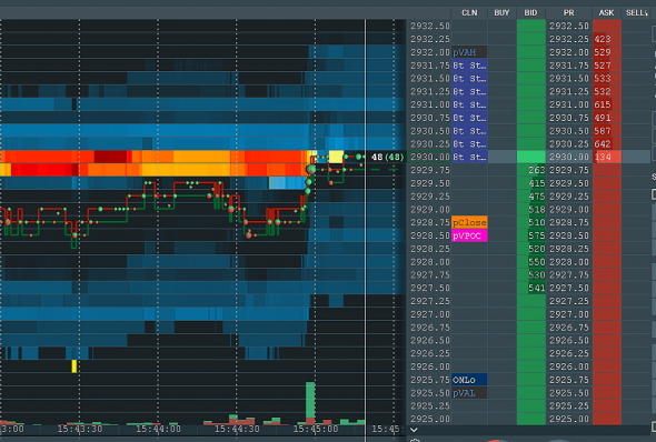
Volume is on the X axis. Below volume is a two-period RSI that is a very short term measure of overbought/oversold. Above volume is a linear regression line (red) with bands of one standard deviation (blue) above and below.
The chart nice illustrates how markets are a joint function of linear trend (the regression line), with one or more cyclical functions overlaid (the movements from upper to lower bands; the movements between short-term overbought and oversold). Notice how often the market will take out a prior low or a previous high, only to cycle back the other way. It's a good illustration of how traders who think primarily in terms of breakouts, momentum, and directional trends get «chopped up» by the market's cyclicality.
